The year is 1970. At a summer camp in the San Bernardino Mountains, a 15-year-old “leadership camper” named Andy Lipkis learns that air pollution from the city is killing Southern California’s forests. It was a striking realization for the budding environmentalist—one that stuck with him until college, and inspired the school project that would change his life.
The goal: to get kids like him—fellow campers and volunteers—to help plant smog tolerant and climate appropriate trees to replace the dwindling pine forests. Andy names the project the “California Conservation Project.” As funding starts pouring in for the effort, Andy and friends and family incorporate CCP as a 501(c)3, and create a Forest Service-like patch that would serve as the organization’s first logo.
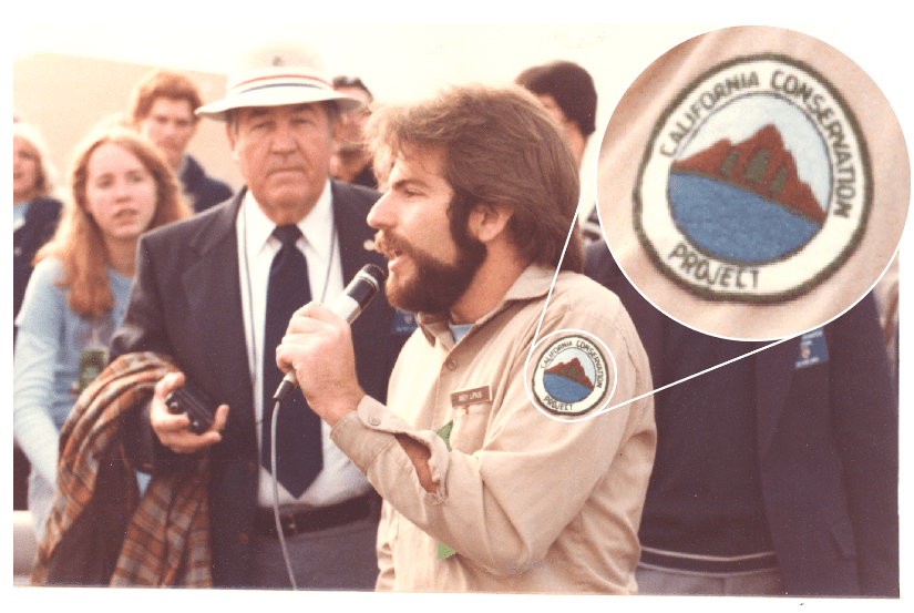
From Andy: “We wanted to have a name and look that created legitimacy that reflected accurately the thrust of the work. [The patch] was adapted for a print graphic for our newsletters that were written by me and then me and Hunter Sheldon (Lovins). The editor and printer was Henry Geiger, a brilliant man, leader and writer in the Theosophy movement, who lived both in a cabin-like structure in Decker Canyon, and had a printing shop in Pasadena and also a small cabin home adjacent to Debs Park.”
The patch helped legitimize the look of the young California Conservation Project staff, and it wasn’t long before the organization began to grow by leaps and bounds. Despite their efforts, however, everyone they worked with—from kids to public officials—referred to them with an unofficial moniker that felt a bit less bureaucratic, and more effortlessly memorable….
Home of the TreePeople (70s-80s)
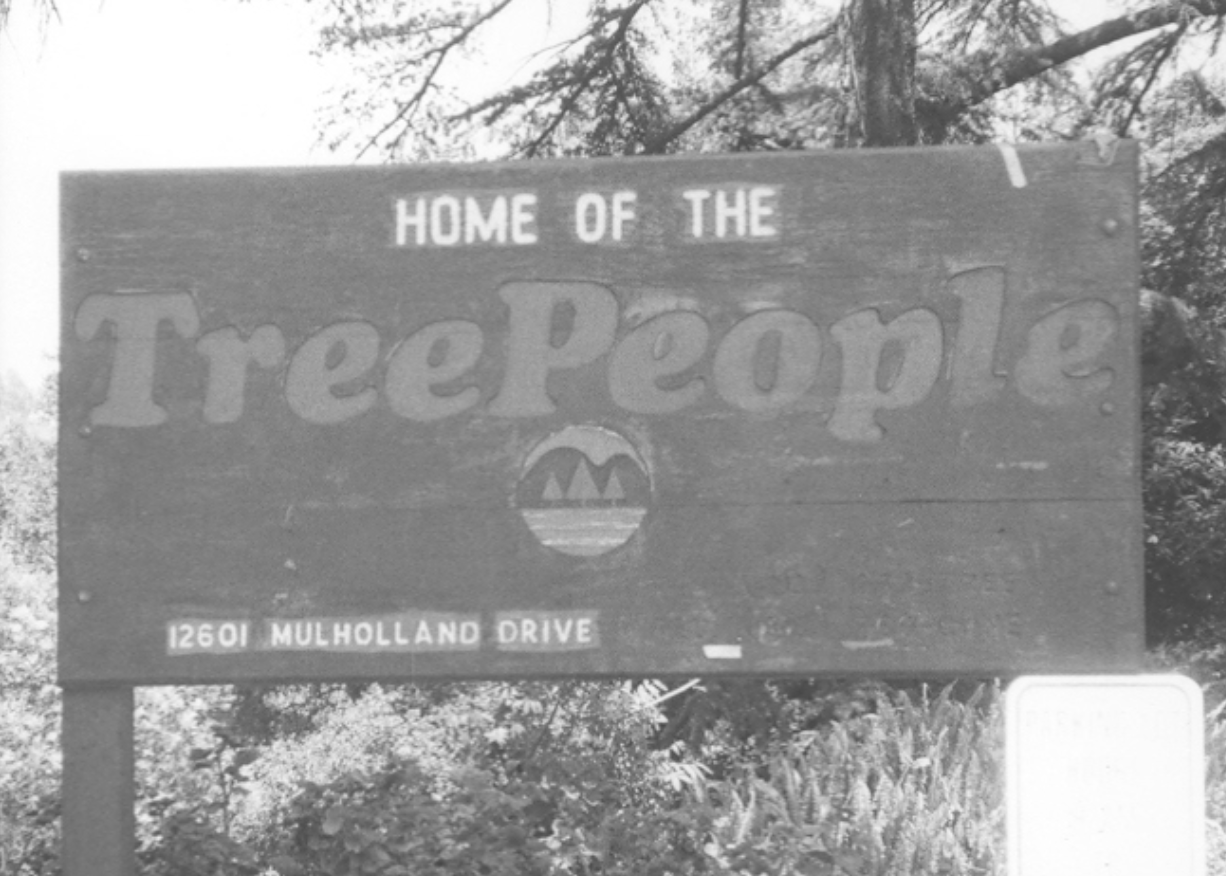
The California Conservation Project came to be known as “the tree people.”
“The name was given to us by everyone,” Lipkis said in an interview with Chris Imhoff. “We NEVER called ourselves ‘The Tree People.’ Once we accepted it, our official incorporated name was ‘California Conservation Project: TreePeople (Inc).’ Then we changed it to officially be ‘TreePeople: California Conservation Project (Inc).’”
The group advised then Governor Jerry Brown and the head of the California Resources Agency, Huey Johnson, on structuring the California Conservation Corps—triggering something of an identity crisis for the nonprofit. The California Conservation Project was perceived to have fully merged with the California Conservation Corps—and thus was assumed to have governmental funding. This wasn’t exactly the case.
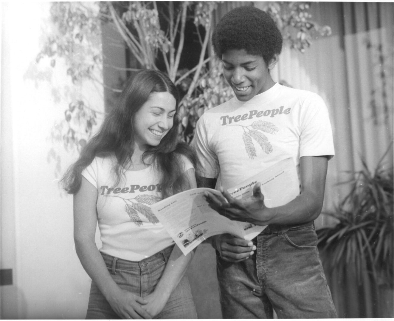
Some members decided a rebrand was in order. On the print production side, Henry Geiger (editor and printer) and his staff graphically simplified the original patch logo into a monochrome graphic, and changed the print newsletters to ‘Tree People News’. Eventually, the team adopted the colloquial ‘tree people’, merging the words and typesetting the name in Cooper Black Italic. ‘TreePeople’ would become the official incorporated name.

TreePeople in the Mainstream (80s-90s)
During the International Year of the Tree in 1982, Andy was invited to be a speaker in Australia, where he would meet his future wife, Kate, whose award-winning advertising experience and design competence would play a major role in shaping TreePeople’s branding throughout the decade.
From Andy: “[Kate’s work] helped ground us when it was time to “grow up”. She’d always worked with graphic designers in her professional life, and that led us to people in the corporate identity field. This was a maturing that came from working with DDB (Doyle Dane Bernbach) ad agency during the million tree campaign.”
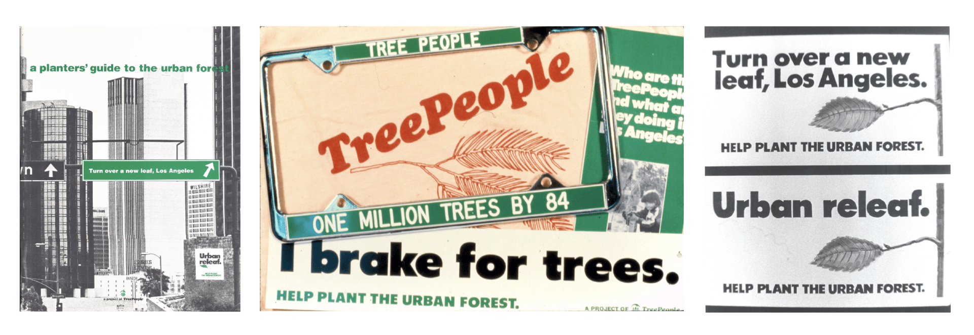
TreePeople would then be introduced to Bright and Associates, one of the top ad firms in the US at the time, who donated the equivalent of $50,000 in design work to develop a new logo for the non-profit.
From Andy: “[This work] included interviewing 50 community leaders including Mayor Bradley, other elected officials, donors, community leaders and staff and focus groups, who generated a list of 50 words that described TreePeople. The process came down to one word that encapsulated the spirit of TreePeople: CARING.”
Andy notes, “interestingly, the naming process was so good that it was almost like psychotherapy. It was indeed identity therapy. We loved the new logo and all its meaning as a reflection of the wholeness and whole systems approach of our work.”
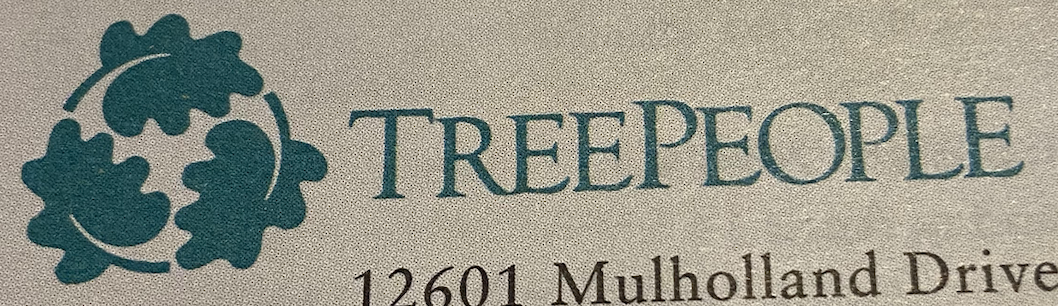
Using this community-centered design prompt, the firm proposed a new logomark: three spinning valley oak leaves. The leaves held multiple messages, including ties to the original Southern California Indigenous stewards of the land, a circle to represent wholeness, cycles, and recycling. The original Cooper Black typeface was replaced with Goudy Oldstyle.
TreePeople, Y2K (00s)
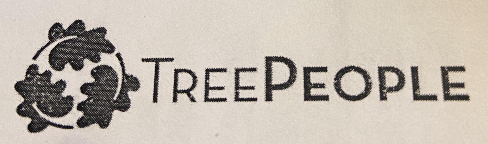
By the new millennium, the TreePeople Communications team felt it was time for a logo refresh. They found a disconnect in the public’s awareness that TreePeople was just as much about community as it was about planting trees. The new goal was to emphasize how community and bringing people together was an essential part of TreePeople’s mission to build a greener future. Thus the Goudy Oldstyle serif was swapped out for the sans-serif Neutra, typeset in Regular and Bold emphasizing the PEOPLE of TreePeople.
A Dramatic Shift (2020-2024)
After over three decades, TreePeople decided to phase out the spinning leaves mark in lieu of a simple wordmark typeset in Cooper Black, TreePeople’s original font. The thinking was that the wordmark could stand on its own and express the friendly approachability of the brand while further simplifying the logo.
The Marketing Communications team would also implement a new brand guide throughout the organization to formalize its design standards and practices, as well as hire its first in-house graphic designer.
Past and Future (2024-Onwards)

As part of the ongoing celebration of its 50th year, and to bridge all the eras of TreePeople’s history, TreePeople announced its new logo in late February of 2024. After gathering feedback from fellow TreePeople staff, volunteers, donors, and community members, the Marketing Communications team got to work.
Developed in-house by TreePeople’s two graphic designers, the refreshed logomark offers a modern, sophisticated update to the classic spinning valley oak leaves. Through a play with depth and scale, the updated mark conveys a fresh sense of generational growth and momentum. The arching branch creates a globe-like feel–representing TreePeople’s collective, holistic work. With the goal of harkening to the past while nodding to an expansive future, TreePeople’s new logomark is intended to capture the magic of TreePeople—past, present, and future.